Sunday 27 March 2011

Final Submission

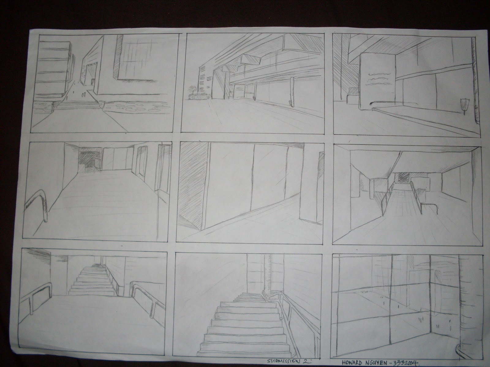
Images of the completed final model.
 Image 1.
Image 2.

Lower section

The theme for the lower section was 'conflicting'. Thus when designing the lower section. I used a flat base for the floor, a spiking roof for the top and a surround curved wall. The wall, floor and roof are all conflicting against one another. Also, the roof is made to be transparent. This allows the building to have a strong presence of an under ground section. The transparent roof also provides a warping and conflicting persepctive when looking at it from differing angles and from either above ground of below ground.

Image 3.

The staircase from the lower to the ground section is a grand staircase. This is to emphasise the celebration and joy of the completion of the artwork by the artist. The grand staircase puts a focus on the artist which will appear at the top of the staircase and make his way down. Further emphasis is added towards the attention of the artist thought the angle of the walls. These walls are slightly angled such that the stair case is almost in a 'V shape' - where a large audience on the ground can congratulate and welcome the artist and his works.

 Image 4.

Upper section

The upper section was based on 'simplicity'. This is emphasised by the use of circles and spheres in the upper section. I believe spheres to be the most simple shape. The design of this upper structure was to allow the artist working at the top a complete view of his surroundings from which he can draw inspiration from. The staircase from the ground to upper section is a spiralling stair case. The staircase leading the the top spirals around the circular shape with hollow rectangular prisms as the base. There are also hand rails and landings/platforms for safety.
 Image 5.

Image of the interior space. with a circular/donut bench for work. The Malangi sculpture sits in the centre, a place where the artist can also draw inspiration from.
Image 6.

3 videos
Scene 1


Scene 2


Scene 3


Link to the Google Sketch up folder:
Note: Sorry I had issues uploading this to Google Warehouse, so I uploaded it to rapidshare instead.

http://rapidshare.com/files/454594959/Model1.7_finalmodelonly_ground.skp

Week 4

The week four lecture guided us into the direction of presenting our models via an animation i.e. sections and scenes - preparation for the final submission.

Sketch-up model

During week 4 I was focused on finalising my model as it approached the submission date.


I developed a base for the model using some inspiration from Image 1. The base was created using a series of overlapping spheres.

Image 1: inspiration.
 Progress image 1.

After making a base for the top half of the section. I did some work on the lower half fixing and perfecting the lower half of the building and also creating a staircase to access the top section. This stair case was a spiral staircase which I believe dramatically adds to the character of the building.

 Progress image 2.

Finally a materials and colours were added to the final model. A ground level was also added.
Progress image 3.

Week 3

Materials
Week three was focused on materials and how we can individualise our models by adding custom drawn materials. In class we brainstormed 45 words to describe the properties, features and qualities of materials. We then narrowed it down to 36 that we individually drew.

Upper material sketches

In lower material sketches

In between material sketches


 I also decided to design some more materials using the computer instead of hand drawings.
These were the outcomes.
Computer generated material 1.

 Computer generated material 2.


Sketch-up Model Progress

I decided to stick with model two from the previous post. This is the development from the previous week. I added the upper section. It directly corresponds to my section sketch of 'Simplified(upper) and conflicting(lower)'

In the upper section I used the president that I discussed in the previous blog. I used circular windows at the top of the sphere to allow natural light through the building (just as the cone with holes did). Also I made a window encompassing the sphere. James noted how it looked like the death star at this particular point (however I wasn't a star wars fan and had no idea what the death star was until he showed me an image).
Progress image 1.
Progress image 2.

Week 2

Stairs:

The week 2 lecture on stairs had me thinking more about the use of my building which was to be created using sketch up. I also began brainstorming possible stair designs to suit my model. 

I also worked on two different sections to see which I would prefer. Decision was aided James' advice. These models were based on simplicity(upper) and conflicting(lower).


Model 1: This was the initial model that I presented to James in the studio session. We discussed important issues about the relevance to the initial artists(Malangi's) work.
 Model 1: Image 1
Model 2: Image 2

 Together we found this image of 'simple architecture' and I decided to use it as a president for my work.

Model 2: After the feed back from James, I began experimentation and work on a new model.

Model 2: Image 1

Tuesday 8 March 2011

Week 1

18 Sketch Sections


Google Sketchup

This was my first use of the program Google Sketchup. All the mechanics were new and to add to that I've never used any other drawing program besides auto-cad. During the first week I experimented with the program and developed many new skills. This was one of the sections that I chose to convert. I found it quite challenging, but also enjoyed it. As I was experimenting I was still unsure of what I would choose for the final submission.

The two words chosen were: Flower (upper) and totem (lower)
Front view.


Upper angle view.

Tuesday 1 March 2011

Task 1: Six Steps

Drawing board task conveying a journey through the university.

A home designed by Dane Richardson named 'House in Dunsborough'.


Sunset photography.


Artists: noun, verb, adjective
Mueck: Boy, crouch, tall.

Malangi: Totem, simplified, bold.

Bansky: flower, conflicting, contrast.